Design and Layout
Utilizing Backgrounds in Your Newspaper
The average Designer probably underestimates the power of the background. Your choice of background allows you to dictate how your message will be noticed. Powerful backgrounds, for instance, can draw the eye and become part of the message. Subtle backgrounds can focus the eye on a particular part of the design where the message is located. Bad backgrounds will distract the eye and create an instant negative feeling regarding the message.
So yes, the background is a vital part of your design. And every design has a background—even if it is just white.
Everything Has a Background
In fact, every picture, every textbox, and every shape in your design has a background, and the backgrounds aren’t necessarily the same thing. Even if you use a photo as your background, depending where you place your text, the background of that text may only be a specific region of the main photo, while text elsewhere may have a background altogether different even though it is on the same image.
You must always be aware of what the background is and how the background draws the eye.
Let’s examine some of the various types of backgrounds and their particular uses.
Solid Color Backgrounds
Perhaps the most common solid color background is just white. Think of a plain piece of paper with something written on it. The background is white and the eye is immediately drawn to the text written on the paper. This is a good example of a background that pushes the eye to the message.
Perhaps the most common mistake that the average designer makes when it comes to solid color backgrounds is they use their favorite color. Your favorite color is most likely one that is meant to be pleasing to your eye, but as a result, it pulls the eye from the message and to the background. The message then becomes the irritant, because the text or the message is messing up the color. What you create is a clash, two things warring for the eye’s attention. See the examples below:

As you can see, the background segments for the resume on the right is what is fighting for your eyes. The text must be focused on intentionally. The resume on the left, however, uses solid backgrounds to bring attention to the content, the message. Colors that are best used are natural tones, earth tones, and soft pastels. These colors, when used as a background, focus the eye on the foreground and the message instead of trying to capture the eye’s attention.
Gradient Backgrounds
A gradient is the transition of one color into another, where the middle of the gradient is a blending of the two colors. White changing into black or the other way around is the most common gradient. Gradients are great for blending elements into the key focus of your background, thus making two colors part of the background.
But like solid color backgrounds, using colors that capture the eye instead of focusing on the message is not considered good design. Below are some gradient background examples. The first two are considered perfectly acceptable. They utilize subtle changes that will focus the eye to the message instead of taking the eye from the message. The last two, do just the opposite. They would be very distracting to the message and would be fighting for the eye's attention.
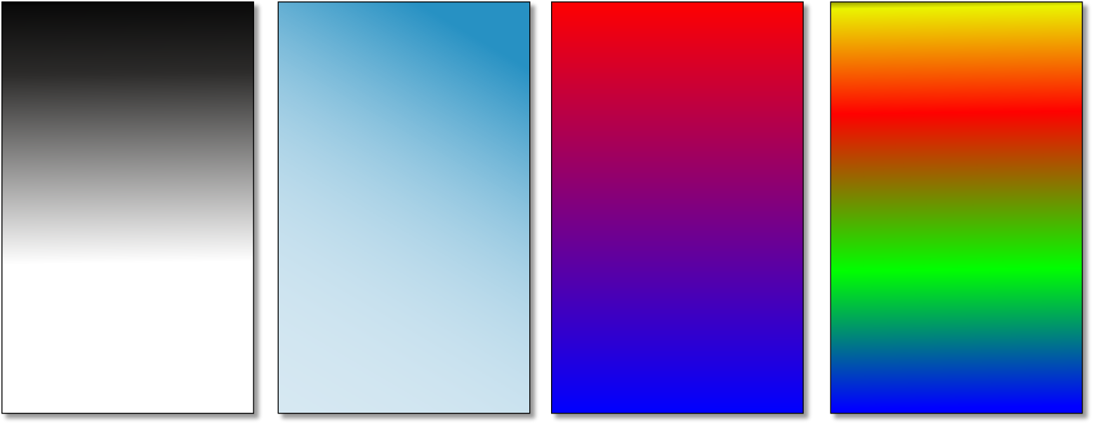
Another type of gradient is to use one color that just fades slightly in one direction. This is more of a subtle gradient where a gray, for example, fades to white or a black fades to a dark gray. These more subtle gradients are used frequently. They are not distracting and don’t clash with the main message.
#4 – Too Many Font Types
There is a perception that different aspects of your message require a different method of expression, thus the tendency to use different fonts. The problem with using different fonts is that it can quickly look messy.
Indeed, many fonts simply don’t look good together or work with other elements on your design. Keeping the number of fonts you use to a minimum makes for better design.
Pattern Backgrounds
There are two types of pattern backgrounds: small patterns that utilize a subtle feel and large patterns that bring a bold appearance. Both have their uses.
Small patterns, such as a cross hatch of lines, small boxes, tiny shapes, and so on, give the design a feeling of texture. It is not meant to even be recognized or noticed. It simply exists and helps to give the other objects more notice. When using such a background, you don’t want to make it too obvious. You want the pattern to be in the background, not fight for the eye with your other objects.
Large patterns, however, are meant to be noticed and thus become very difficult to use effectively. Using larger patterns as a background may require that you layer backgrounds so that your message doesn’t get lost. For example, use a white or black box on top of your background and then put your text within that box.
Below are some example of pattern backgrounds and how you can use them.

#6 – Wrong Image Selection
Image selection is important for a number of reasons. The image needs to emphasize and enhance your message. Sometimes, designers will have an image (often a personal image) that they love and wish to use in their design—regardless if it is a good fit or not.
Great designers know that image selection is vital to the overall appeal and impact of their design. When looking at an image, it is important to look at how busy the image is, the colors, and where the eye naturally falls on the image. Choosing an image, for example, that has clashing colors with the rest of your design will make your printed material less appealing to the eye.
Photo Backgrounds
One of the most difficult backgrounds to work with is the use of a photo. A photo demands attention. It is often busy and has a background all of its own. Thus a photo as a background can compete with your other elements.
Usually, designers who use an image as a background intend the image to be part of the message. In this way, they need to blend only a few other elements into the design to get the right effect. Below is an example of two flyers. The left one allows the image (the background) to be part of the message. The other one does not, so the eye fights to find what it is supposed to focus on.

When using images as a background, you want to use a powerful image that viewers can relate to and instantly grasp the message and meaning.